Zapper
Turning WhatsApp chaos into enterprise-grade control.
- Year
- 2019–2022
- Role
- Sole Product Designer
- Tools
- Adobe XDWebflowIllustratorAfter Effects
- Status
- Completed
1 → 4
Enterprise clients in the first months of operation
570K+
Messages processed and monitored
3
New B2B contracts secured through design-driven credibility
Context
- The problem
No visibility into WhatsApp sales
Companies that rely on WhatsApp as their primary sales channel had no visibility into what their teams were saying, or when. No compliance, no audit trail, no way to identify risk before it became a liability.
- The users
Managers in regulated industries
Enterprise managers in financial services, healthcare and retail. Decision-makers who needed to trust the product before they’d trust the data it showed them.
My role
I was the sole designer on the project, working directly with the CEO and CTO from day one. My scope covered everything: brand identity, information architecture, platform UI, analytics reports and landing pages.
No design team, no handoffs. Every decision was mine to make and defend.
Enterprise clients in regulated industries don’t buy software, they buy confidence.
Brand
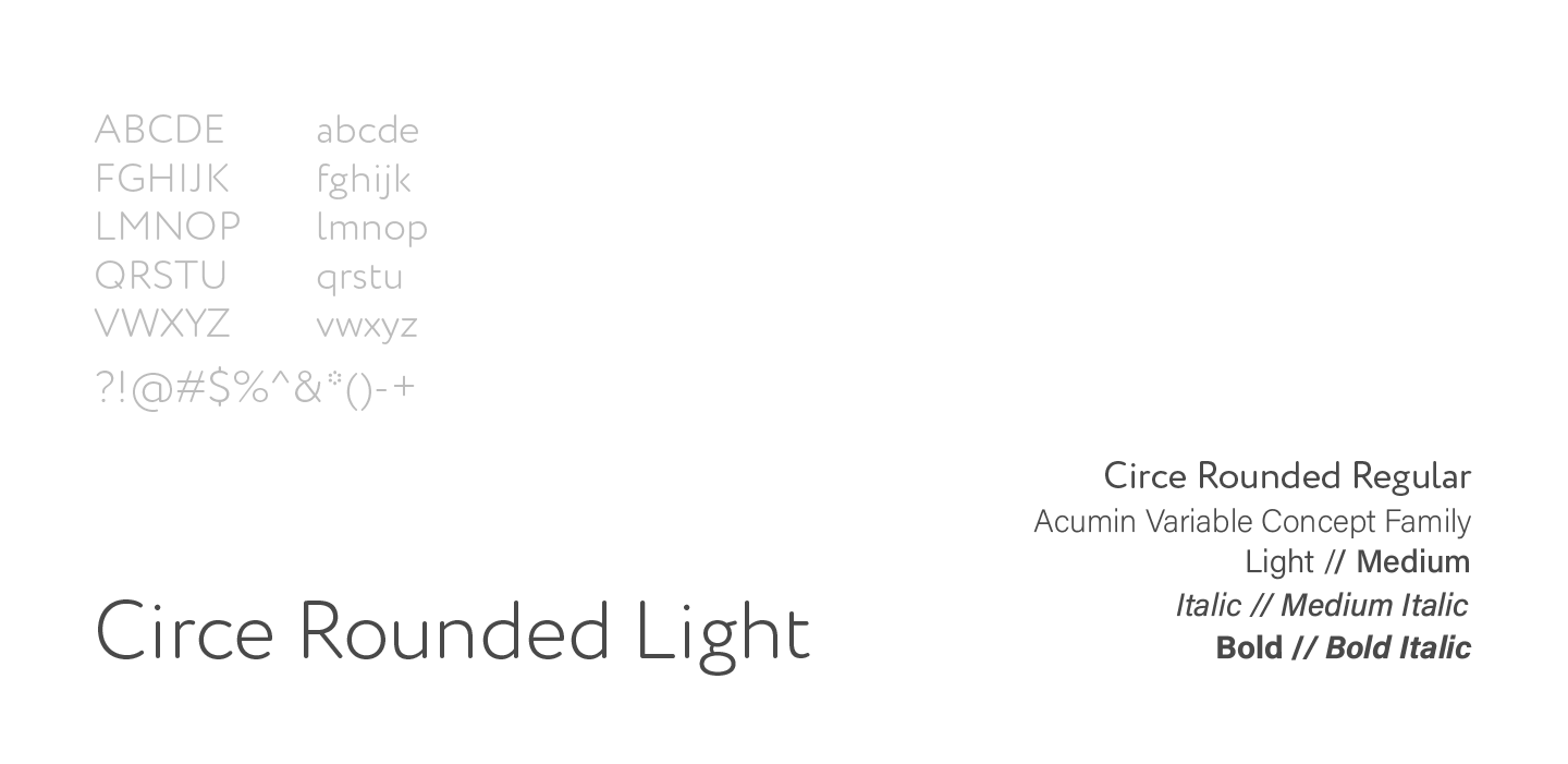
The brand needed to communicate security and control before anyone opened a single dashboard. The color system combined a WhatsApp-adjacent green (to signal familiarity) with a purple inherited from the parent company (to signal institutional credibility).
- #00AF84 Green Familiarity
- #6818A2 Purple Institutional credibility
- #494949 Dark gray
The logo
The logo construction, Z + speech bubble, made the product’s purpose legible at a glance.

Designing for control without complexity
The platform’s configuration model emerged from real client behavior, not assumptions. Managers needed granular control, but operational overload was a real risk.
The solution was a layered hierarchy. Each layer added specificity without requiring the user to understand the layer below it. Configuration became progressive, not overwhelming.
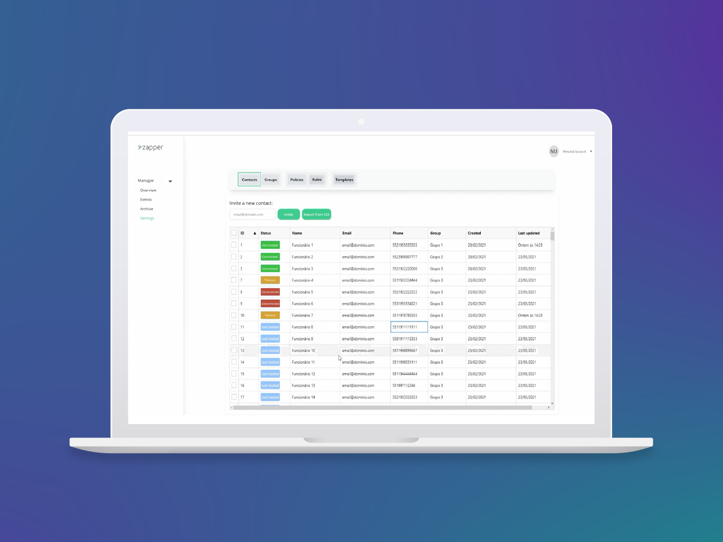
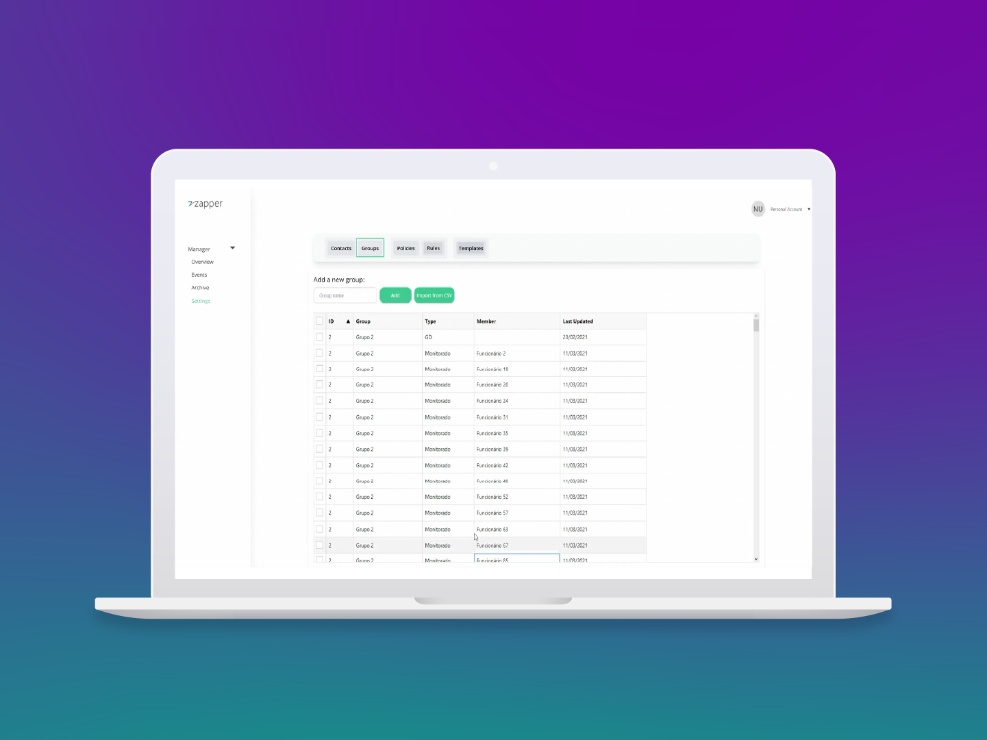
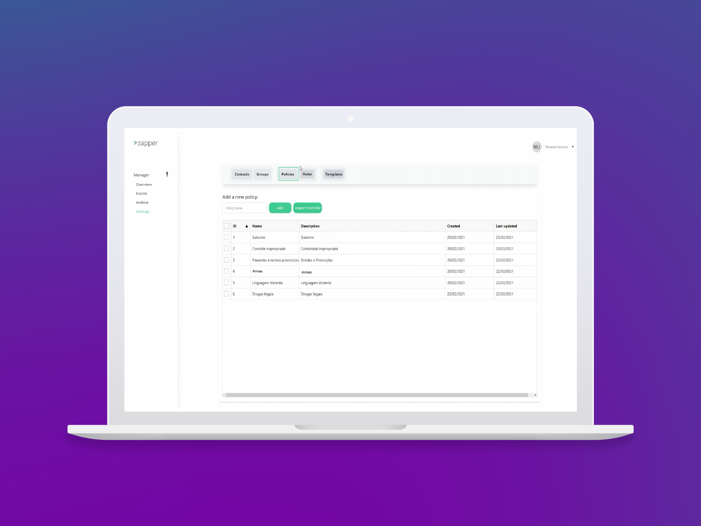
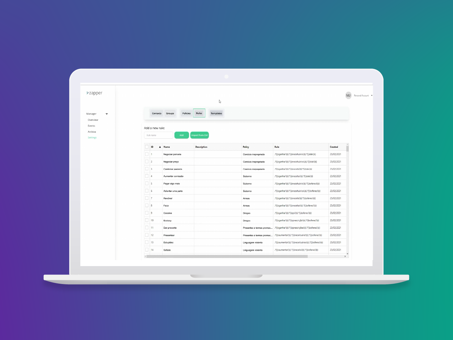
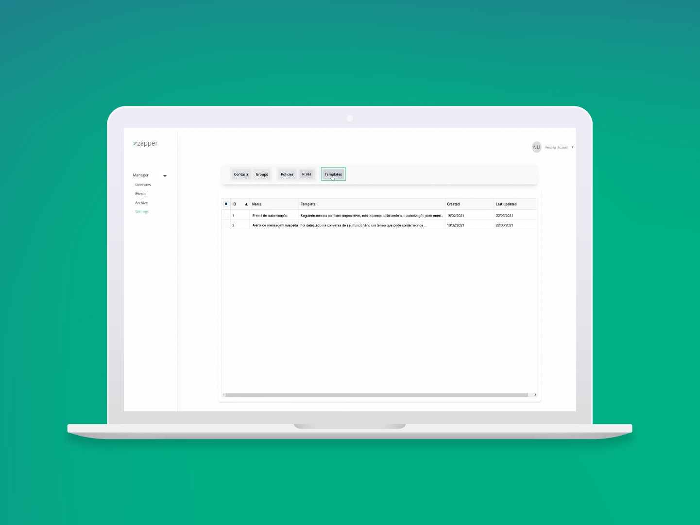
Contacts → Groups → Policies → Rules → Templates. Click a layer to see its screen.
Making risk visible at a glance
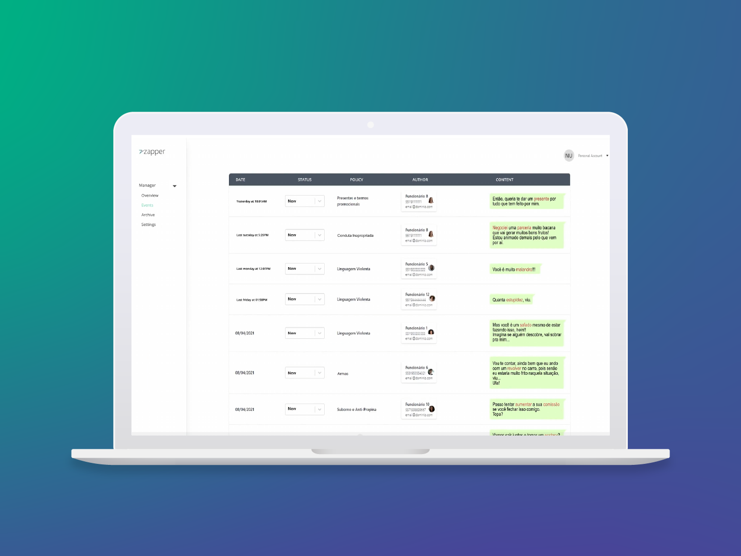
The Events panel was the most critical view in the platform, and the most data-dense. Managers needed to scan hundreds of flagged messages, assess severity and act quickly. The design had to make that possible without requiring deep reading. The solution was a table built on three things:
- 01
Color-coded status indicators
- 02
Policy labels visible inline
- 03
Message previews that surface intent without a click
Every column earned its place. Clicking a flagged message expanded the conversation thread, giving managers the context behind the violation, not just the isolated message.
The dashboard before the dashboard
While the platform’s built-in analytics were still in development, enterprise clients needed something they could bring to a board meeting. I designed a monthly PDF report that translated raw WhatsApp data into executive-ready insights: response times, message volume trends, policy violations by category.
It was a provisional solution, but one that worked.
Beyond the platform
The brand extended into the institutional landing page, built in Webflow with on-page SEO that ranked among the top results for target keywords, and into social media assets for acquisition campaigns.
Result
The platform processed 570,000+ messages in its first operational months, serving clients from highly regulated industries. Three new enterprise contracts were secured beyond the initial client, a direct consequence of design that communicated trust before any sales conversation happened.
In B2B enterprise products, design is about reducing the buyer’s perceived risk.
Reflection
Trust is a design material. In regulated industries, every color choice, every label, every empty state is either building or eroding confidence. I learned to design for the skeptic in the room, not the enthusiast.
I would have pushed to be in those client conversations directly, instead of receiving requirements filtered through the founders. Firsthand exposure to compliance managers would have sharpened my decisions.
The natural next steps: a real-time dashboard to replace the monthly PDF reports, and a mobile view for managers who need to act on flagged events outside the office.