Mini Game Series
Ten classic games. Ten different faces.
YEAR
2026
ROLE
UX/UI Designer
Illustrator
TOOLS
Figma
Claude (code and sound)
STATUS
In progress (2/10)
Visual Range
One screen structure,
a new identity in every game
Microinteractions and sound designed as carefully as screens
Built-in tooling
Figma plugins built along
the way to support my workflow
My role
I designed everything except the code and sound effects: the theme of each game, UX flows, UI, illustrations, copy and the timing of every animation. Each game went from references to wireframe to Figma, and then into a playable build made with Claude, adjusted round after round until it felt right.
Tic-Tac-Toe: where the system was born
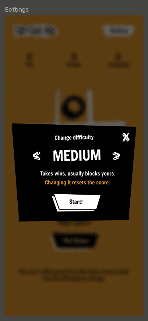
The first game set the rules for the whole series. The start screen with a single difficulty selector, the game screen and the settings modal were all defined here, and every game after it follows the same structure.
Bold and angular
Jagged, angular shapes, offset shadows on the buttons and text that is never straight: every line has its own tilt, defined in Figma. Pieces land like stamps, each at a slightly random angle and size, so no two look the same.

Persona 5 Royal: jagged cuts, tilted type and three flat colors.
Fewer elements, clearer state
There is no menu button. The difficulty badge in the corner shows the current level and opens the modal to change it. One arrow, mirrored, and one button in three versions (black, inverted and a small white badge) keep the asset list short and the system consistent.
Three levels, three personalities
Polished by playing
23 versions, most of them small fixes found by playing on a phone: arrows that jumped when the level name changed length, a button that only moved its background when pressed, a computer that played so fast the sounds got annoying. Those fixes became the base for every game that came next.


Three screens in Figma, one live build: the structure every next game follows.
Jo-Ken-Paw!: a picnic standoff
Rock-paper-scissors as a picnic standoff: a fox and a bear play for the last baguette. A deliberate contrast with Tic-Tac-Toe, soft and cozy where the first one is loud, built on the same screen structure.
Acorn crushes Beetle. Beetle cuts Leaf. Leaf wraps Acorn. The name mixes the Brazilian jokenpô, from the Japanese jan-ken-pon, with paw: the paws are the ones playing, and "Paw!" lands right when they flip.

Wireframe to final
Like every game in the series, it started as a rough playable prototype: I describe the game and its rules, and Claude builds a first version in code with placeholder visuals. It lets me test flow and pacing before drawing anything. Navigation was already solved by the shared structure, so the prototype only had to answer what was new: picking a mode, the countdown, the reveal and the end of a match. From there, I designed the final layout and art in Figma.


Left, the playable prototype that tested the flow. Right, the final screen designed in Figma.
Soft colors, clear signals
Pastel palettes are easy to love and easy to lose: everything starts to weigh the same. So only the interface goes pastel, while the scene and the characters keep fuller colors. And each hue means one thing only: brown carries every line of text, yellow and orange mark the choices, teal is the action to take, and blue is saved for what is happening right now, like the result on the baguette. The bread is there for a reason too: the gingham is too busy for text, so the phrase sits on the baguette. Depth follows the same rule: only what you can press has a 3D base, and panels stay flat.
Details that make it feel alive
The paws flip like cards on "Paw!" and reveal the object
at a random angle.Every result explains the rule ("Acorn crushes Beetle!"), always in two lines so the baguette keeps its shape.
While you think, the choice buttons hop in turn: first after 0.8 s, time to read, then every 2.5 s.
Buttons stay pressed for at least 140 ms, even on a quick tap.
At the end, the winning paw grabs the baguette and pulls it to its side before the panel opens.
Bubbles, paw pats, a "fwip" on the flip and kalimba notes, all in the same pentatonic scale.
Tools for my own workflow
Tile fill: fills a shape with a tile from the canvas, so the pattern stays editable.
Checklist maker: checklists inside the file for screens, states and assets.
Day stamper: marks the days I worked on the project.

Result
Two games are live on itch.io, playable on phone or desktop, with touch and keyboard controls. They look nothing alike, yet they share the same screen structure, and the difficulty selector is the same component in both, so the system was put to the test as well as the style. Along the way the process settled into a repeatable path, from a rough playable prototype to a published game, with seven Figma plugins that come along to every next game. Eight to go.
Reflection
Keeping the same structure made each new identity easier to judge: with navigation already solved, every decision was about look and feel, and those decisions were mine, from the art and the copy to how long a result stays on screen. Playing every build on a real phone sharpened the details: Tic-Tac-Toe went through 23 versions of small fixes I spotted along the way, and Jo-Ken-Paw! only felt right once I slowed the pacing down, with each beat of the countdown going from 0.45 s to 0.65 s.
Claude was the support that brought the interaction layer to life in code and sound, and the series became a way to go deeper into new ways of working with AI, while the creative process stays in my hands. Next in the series: Memory and Simon.